Monday 20 June 2011

Evaluation

For this unit we had to create several game scenes which would be seen in a game created by us. they would be manipulated into the style of a game. To start off we had to go to Dartmoor which is a nature reserve in Devon. here we had to collect images and ideas to create our game scenes.


Once we had these images and gathered our ideas for our game scenes, we practised line drawings on paper and researched them aswell to get an idea of how we would design our character.


After this I scanned in an image of a mannequin which i had drew. I then opened it up in photoshop and used the pen tool to go around my image and added a stroke to the pen tool. I then made the image symmetrical, all in the same place just opposite each other. I then started to create my wooden mannequin by getting a few wooden textures then manipulating them onto my mannequin. I then turned the opacity down on the wooden texture layer, then added a new layer behind with a solid wood colour. This made it darker and more wooden. I then used the burn tool to ad some shaded detail to make it more 3D. I then made the silver mannequin. I used the same technique, just changed the colour of the solid coloured layer, to silver. I then used the dodge and burn tool to give shining detail and some shaded areas to the body. I used the same technique her to make the gold mannequin except i changed the solid colour layer colour to a gold-ish colour and set the blending mode to divide. I then used the dodge and burn tools to add a shine and some shading.


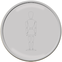
I then went on to making my first token. I made it a wooden texture as the wooden mannequin has to find them. I started off by finding a wood texture on the internet, them manipulating it in photoshop. I then made my coin shape and outline by stroking several paths made by the elliptical marquee tool. i then filled in all the gaps with wood colours. I then placed my wood texture behind this coloured layer and turned the opacity down. I then added my mannequin outline and edited the colour of it and the bevel and emboss.


I then went on to making my final designs. I opened three images which I took from Dartmoor and opened up my three images of mannequins, one wood, one silver, one gold. I then added a filter called fresco to each image background. I also opened my images of tokens. I then placed a mannequin into each image. I then used the transform tool to resize a place each mannequin into the image and make it look more realistic. I then used layer masks and the brush tool to hide parts of the mannequins behind objects like trees or rock to make them fit into the image properly. I did this with the coins as well.

My background images give the impression that its a mystical quite place in which this mannequin creature is living in and investigating. I chose to use images which had a main focus rather than a landscape image so that when it cam to manipulating it it would still have a focus and give the impression that there are several areas to this game. When placing the characters into the image, I decided that no facial expression would be needed, as they were a mysterious character. Below are my final images which I have manipulated into an in game scene.

If I were to do this again I would use a different character as my mannequin was just a drawing that i made whereas if i used a different character I would have to create a new one from scratch, rather than falling back on previous work. Also I would use different tokens as my coins were quite an obvious and common token to be involved within a game. 

Game Screens

The game screens below are other scenes which I possibly could have used for my final three game screens. the first image below would be my game cover. I made these game screens in photoshop and added a filter to all of the backgrounds. I then added in my coins as they are to be collected within the game so this is what it would look like.


Wednesday 15 June 2011

Tokens

For my game I had to make several tokens in which would be involved in the game. I came up with the idea of having different coloured/textured coins for each mannequin.


For my first token I would make it a wooden texture as the wooden mannequin has to find them. I started off by finding a wood texture on the internet, them manipulating it in photoshop. I then made my coin shape and outline by stroking several paths made by the elliptical marquee tool. i then filled in all the gaps with wood colours. I then placed my wood texture behind this coloured layer and turned the opacity down. I then added my mannequin outline and edited the colour of it and the bevel and emboss.


I then went on to making my silver coin in the same way as i made the wooden one. I used more colour overlays to make the silver colour and added a slight shine by using the dodge tool. I then realised that this wants enough shine for a silver coin so I added more by stroking paths made by the pen tool with a soft edged brush. I then changed the colour of the mannequin outline.


 I then used the same method as I did with the silver coin, but used a gold overlay and added a golden shine as I did with the silver coin. This what the outcome was for my golden coin. I then went on to changing the colour of the mannequins outline to gold . I again added more shine to the coin using the dodge tool to make it look more like real gold.

Tuesday 14 June 2011

Manipulated Game Scenes.

To start with I opened three images which I took from Dartmoor and opened up my three images of mannequins, one wood, one silver, one gold. I then added a filter called fresco to each image background.

I then went on to drag a mannequin into each image. I then used the transform tool to resize a place each mannequin into the image and make it look more realistic. I then used layer masks and the brush tool to hide parts of the mannequins behind objects like trees or rock to make them fit into the image properly.

With the gold mannequin i edited the original image if it and place his arms above his head so when I place him in the image, it would look as if he was climbing up the tree. I did this because there was going to be a coin up there and wanted to make the scene look as if he was trying to reach it.

My background images give the impression that its a mystical quite place in which this mannequin creature is living in and investigating. I chose to use images which had a main focus rather than a landscape image so that when it cam to manipulating it it would still have a focus and give the impression that there are several areas to this game. When placing the characters into the image, I decided that no facial expression would be needed, as they were a mysterious character. Below are my final images which I have manipulated into an in game scene.


After studying road signs and how they convey meanings I went on to adding tokens to my image. My tokens were going to be coins For what ever colour the mannequin in the image was, i would that colour coin. I used the free transform tool to fit them into the image then used layer masks to make the coins be slightly hidden behind an object such as a tree or a rock. This is how they came out.


Player Images

These are the images which i have created foe each of the wooden, silver and golden characters. I used my original scanned image which i drew from hand to get these characters outlines.

to start with I used the pen tool to go around my image that I scanned in and added a stroke to the pen tool. I then made the image symmetrical, arms legs feet, all in the same place just opposite each other. I then started to create my wooden mannequin by getting a few wooden textures then manipulating them onto my mannequin. I then turned the opacity down on the wooden texture layer, then added a new layer behind with a solid wood colour. This made it darker and more wooden. I then used the burn tool to ad some shaded detail to make it more 3D.

I then made the silver mannequin. I used the same technique, just changed the colour of the solid coloured layer, to silver. I then used the dodge and burn tool to give shining detail and some shaded areas to the body. I used the same technique her to make the gold mannequin except i changed the solid colour layer colour to a gold-ish colour and set the blending mode to divide. I then used the dodge and burn tools to add a shine and some shading.

Here is the original image which I scanned and used as an outline, plus my symmetrical outline which I used with the pen tool from my scanned in image and my 3 final character designs.


Monday 13 June 2011

Game Tokens


A token is an object within a game which can either be used, or represent a piece of information.Tokens in games are normally used to convey a meaning.

Tokens are used in a similar way as road signs. What I mean by this is that road signs are just a symbol or simple letter to represent a certain place or information on what's coming up ahead. They stand out so they can be seen easily by the driver, or in this case the token stands out so that the person playing the game can see the token easier and be able to pick it up or use it.

Tokens can be used as a pick-up in which you might need later on the game. They are also used as a way as showing what is yet to come in the game. Also they can be used as signs, for instance, in the game, if there was a sign by a closed gate which had a cross on it saying 'do not enter, chances are you wont want to enter through the gate in-case of any danger. The same way road signs are used, you would want to obey them other wise you could put yourself in danger


Here are some of the most common road signs seen around. As you can see they are very easy to understand and even without the text underneath, you could probably still workout the meaning of them.

this is important for tokens in games because you would want to know what that token does straight away rather than guessing what it be be used for. Like if there was a key, you know that its most likely used to unlock a door or padlock etc. so you can progress further into the game.

Monday 6 June 2011

Research On Artist - Every Day Objects

Andy Warhole is a famous artist most famous for his pop art. One of his pieces is his drawing of Campbell's soup can. This has become one of his most famous drawings. My imitationof Andy Warhole's work is of a galaxy bar. I used the pen tool and gradients to create it.


Pablo Picasso has used an acoustic guitar in on of his paintings. This painting is called 'The Old Guitarist'. This painting could represent a person who has been playing a musical instrument all their life.


Marcel Duchamp has used a really common object in one of his pieces, A wheel. This is an everyday day object mainly used in transport. There  isn't much in common with the wheel and the stool which is maybe the idea of this painting.


Claes Oldenburg's art is mainly big everyday objects. It has quite a surreal feel to it as normally a safety pin is tiny compared to a human whereas here he has made it so the human is tiny compared to the safety pin. My imitation of Claes Oldenburg's work is a big earphone in a field.